On the world wide web (www) or the internet, we have our website visited by people from different countries and languages. Some of the languages are read from left to right (like English), and some from right to left (like Arabic). So when the direction of the language gets changed it is good for the website layout to change accordingly as well as a good user experience so that the website doesn't look bad.
To accommodate for the language intricacies, we have to make the website layout responsive in every language and its reading direction.
TL;DR
<!-- Changing language direction to `rtl`  -->
<html lang="en" dir="rtl">
  <body>
    <div class="box-1">Hello World 1</div>
    <div class="box-2">Hello World 2</div>
  </body>
  <!-- Style for the red color box -->
  <!--
    Using `margin-inline-end` instead of `margin-right`
    for better internationalization
  -->
  <style>
    .box-1 {
      display: inline-block;
      width: 300px;
      height: 300px;
      background-color: red;
      color: white;
      margin-inline-end: 30px;
    }

    .box-2 {
      display: inline-block;
      width: 300px;
      height: 300px;
      background-color: red;
      color: white;
    }
  </style>
</html>
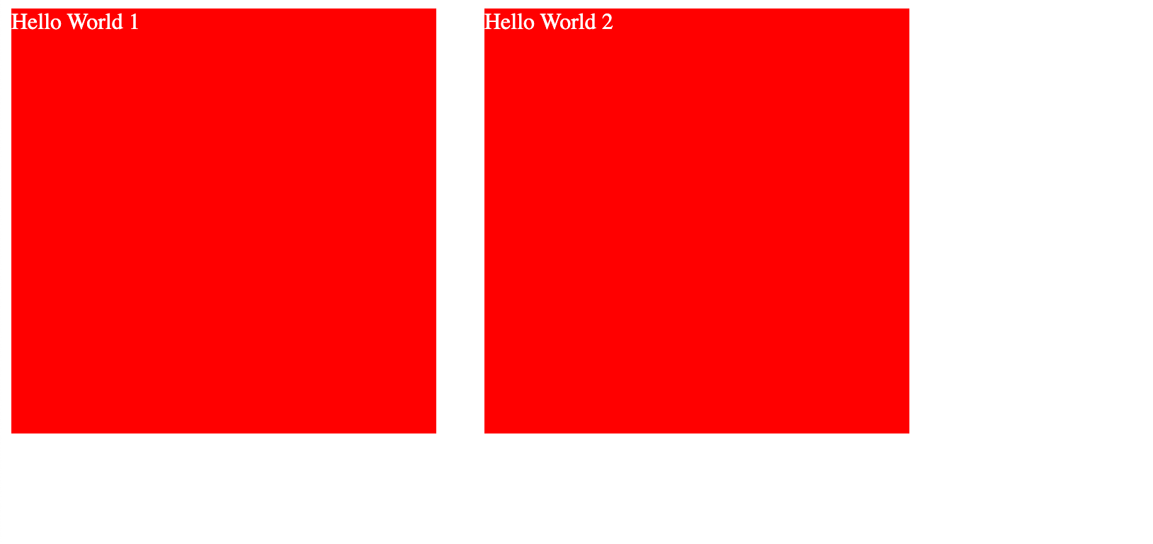
For example, suppose we have a layout with two red background color boxes side by side that has the text called Hello World 1 on the first box and Hello World 2 on the second box like this,

The HTML code will look like this,
<html lang="en" dir="ltr">
  <body>
    <div class="box-1">Hello World 1</div>
    <div class="box-2">Hello World 2</div>
  </body>
  <!-- Style for the red color box -->
  <style>
    .box-1 {
      display: inline-block;
      width: 300px;
      height: 300px;
      background-color: red;
      color: white;
    }

    .box-2 {
      display: inline-block;
      width: 300px;
      height: 300px;
      background-color: red;
      color: white;
    }
  </style>
</html>
Now let's add a right margin of 30px to the first box like this,
<html lang="en" dir="ltr">
  <body>
    <div class="box-1">Hello World 1</div>
    <div class="box-2">Hello World 2</div>
  </body>
  <!-- Style for the red color box -->
  <!-- Adding 30px right margin to the first box -->
  <style>
    .box-1 {
      display: inline-block;
      width: 300px;
      height: 300px;
      background-color: red;
      color: white;
      margin-right: 30px;
    }

    .box-2 {
      display: inline-block;
      width: 300px;
      height: 300px;
      background-color: red;
      color: white;
    }
  </style>
</html>
Now the webpage looks like this,

Have you noticed the dir="ltr" attribute on the main html tag in our HTML code? This refers to the language direction of the content on the webpage. The dir refers to the direction and the value ltr refers that the direction of the language from left to right (ltr). This is the default for languages like English. Now let's change the dir attribute's value to rtl which refers that the direction of the language from right to left.
It can be done like this,
<!-- Changing language direction to `rtl`  -->
<html lang="en" dir="rtl">
  <body>
    <div class="box-1">Hello World 1</div>
    <div class="box-2">Hello World 2</div>
  </body>
  <!-- Style for the red color box -->
  <!-- Adding 30px right margin to the first box -->
  <style>
    .box-1 {
      display: inline-block;
      width: 300px;
      height: 300px;
      background-color: red;
      color: white;
      margin-right: 30px;
    }

    .box-2 {
      display: inline-block;
      width: 300px;
      height: 300px;
      background-color: red;
      color: white;
    }
  </style>
</html>

As you can see that after changing the dir attribute's value from ltr to rtl, the whole box with the text is now shifted to the right side since the language direction is now changed.
Have you noticed something weird here?
You may have guessed that the margin-right of 30px is applied but is not taking effect between the boxes like we needed after we changed the dir attribute.
Well, we can't blame the browser since we have defined it specifically to be applied to the right side of the box, and it is getting applied to the right side of the last box. (Since the direction is now from right to left, the first box on the end of the screen) Because of this, we now have a weird-looking website. This is huge and will break the website layout if our layout is more complex and large.
To accommodate for this problem of not switching the right margin when we change the language direction, we now have an internationalized version of the margin-right property which is the margin-inline-end.
Let's replace the margin-right property in the box-1 box class name with the new property of margin-inline-end in our HTML code like this,
<!-- Changing language direction to `rtl`  -->
<html lang="en" dir="rtl">
  <body>
    <div class="box-1">Hello World 1</div>
    <div class="box-2">Hello World 2</div>
  </body>
  <!-- Style for the red color box -->
  <!--
    Using `margin-inline-end` instead of `margin-right`
    for better internationalization
  -->
  <style>
    .box-1 {
      display: inline-block;
      width: 300px;
      height: 300px;
      background-color: red;
      color: white;
      margin-inline-end: 30px;
    }

    .box-2 {
      display: inline-block;
      width: 300px;
      height: 300px;
      background-color: red;
      color: white;
    }
  </style>
</html>
The webpage now looks like this,

As you can see that the 30px margin is now applied to its left side and the layout is now automatically corrected by changing the direction of the language. This will make our website more responsive and internationalized when the dir changes from ltr or rtl.
We have successfully made our webpage layout look good using internationalization standards.
See the above code live in codesandbox.
That's all 😃!