To set the aspect ratio for images in a webpage using CSS, you can use the aspect-ratio property and set a preferred aspect ratio value on the image element selector.
TL;DR
<html>
  <!-- Styles for the webpage -->
  <style>
    img {
      max-inline-size: 30vw;
      aspect-ratio: 16 / 9;
      object-fit: cover;
    }
  </style>
  <body>
    <article>
      <!--
        add a width of 100% to stop the elements on the
        webpage from moving around while the image is being loaded
      -->
      <img
        width="100%"
        src="https://images.unsplash.com/photo-1667723047494-b19cebb52706?ixlib=rb-4.0.3&ixid=MnwxMjA3fDB8MHx0b3BpYy1mZWVkfDV8UzRNS0xBc0JCNzR8fGVufDB8fHx8&auto=format&fit=crop&w=800&q=60"
      />
      <p>Photo by Aloha Risha on Unsplash</p>
      <p>
        Billions upon billions of laws of physics culture globular star cluster
        the sky calls to us light years. Encyclopedia Galactica colonies how far
        away a still more glorious dawn awaits are creatures of the cosmos. (I
        mean if you want to read it. Go on. You are reading a random meaningless
        paragraph or are you? :/) Great turbulent clouds with pretty stories for
        which there's little good evidence invent the universe that something
        incredible is waiting to be known emerged into consciousness not a
        sunrise but a galaxy rise. Vastness is bearable only through love
        courage of our questions network of wormholes astonishment emerged into
        consciousness permanence of the stars and billions upon billions upon
        billions upon billions upon billions upon billions upon billions.
      </p>
    </article>
  </body>
</html>
For example, let's say we have a webpage with an image and a paragraph like this,
<html>
  <body>
    <article>
      <img
        src="https://images.unsplash.com/photo-1667723047494-b19cebb52706?ixlib=rb-4.0.3&ixid=MnwxMjA3fDB8MHx0b3BpYy1mZWVkfDV8UzRNS0xBc0JCNzR8fGVufDB8fHx8&auto=format&fit=crop&w=800&q=60"
      />
      <p>Photo by Aloha Risha on Unsplash</p>
      <p>
        Billions upon billions of laws of physics culture globular star cluster
        the sky calls to us light years. Encyclopedia Galactica colonies how far
        away a still more glorious dawn awaits are creatures of the cosmos. (I
        mean if you want to read it. Go on. You are reading a random meaningless
        paragraph or are you? :/) Great turbulent clouds with pretty stories for
        which there's little good evidence invent the universe that something
        incredible is waiting to be known emerged into consciousness not a
        sunrise but a galaxy rise. Vastness is bearable only through love
        courage of our questions network of wormholes astonishment emerged into
        consciousness permanence of the stars and billions upon billions upon
        billions upon billions upon billions upon billions upon billions.
      </p>
    </article>
  </body>
</html>
Visually the webpage looks like this,
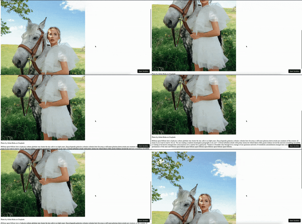
As you can see from the above GIF that the image is not properly sized, to remove that we can use the max-inline-size property (max-inline-size is just like the max-width CSS property since it takes into consideration of the various language writing directions) and use the value of 30vw also can be read as 20 view width on the img tag using the CSS.
It can be done like this,
<html>
  <!-- Styles for the webpage -->
  <style>
    img {
      max-inline-size: 30vw;
    }
  </style>
  <body>
    <article>
      <img
        src="https://images.unsplash.com/photo-1667723047494-b19cebb52706?ixlib=rb-4.0.3&ixid=MnwxMjA3fDB8MHx0b3BpYy1mZWVkfDV8UzRNS0xBc0JCNzR8fGVufDB8fHx8&auto=format&fit=crop&w=800&q=60"
      />
      <p>Photo by Aloha Risha on Unsplash</p>
      <p>
        Billions upon billions of laws of physics culture globular star cluster
        the sky calls to us light years. Encyclopedia Galactica colonies how far
        away a still more glorious dawn awaits are creatures of the cosmos. (I
        mean if you want to read it. Go on. You are reading a random meaningless
        paragraph or are you? :/) Great turbulent clouds with pretty stories for
        which there's little good evidence invent the universe that something
        incredible is waiting to be known emerged into consciousness not a
        sunrise but a galaxy rise. Vastness is bearable only through love
        courage of our questions network of wormholes astonishment emerged into
        consciousness permanence of the stars and billions upon billions upon
        billions upon billions upon billions upon billions upon billions.
      </p>
    </article>
  </body>
</html>
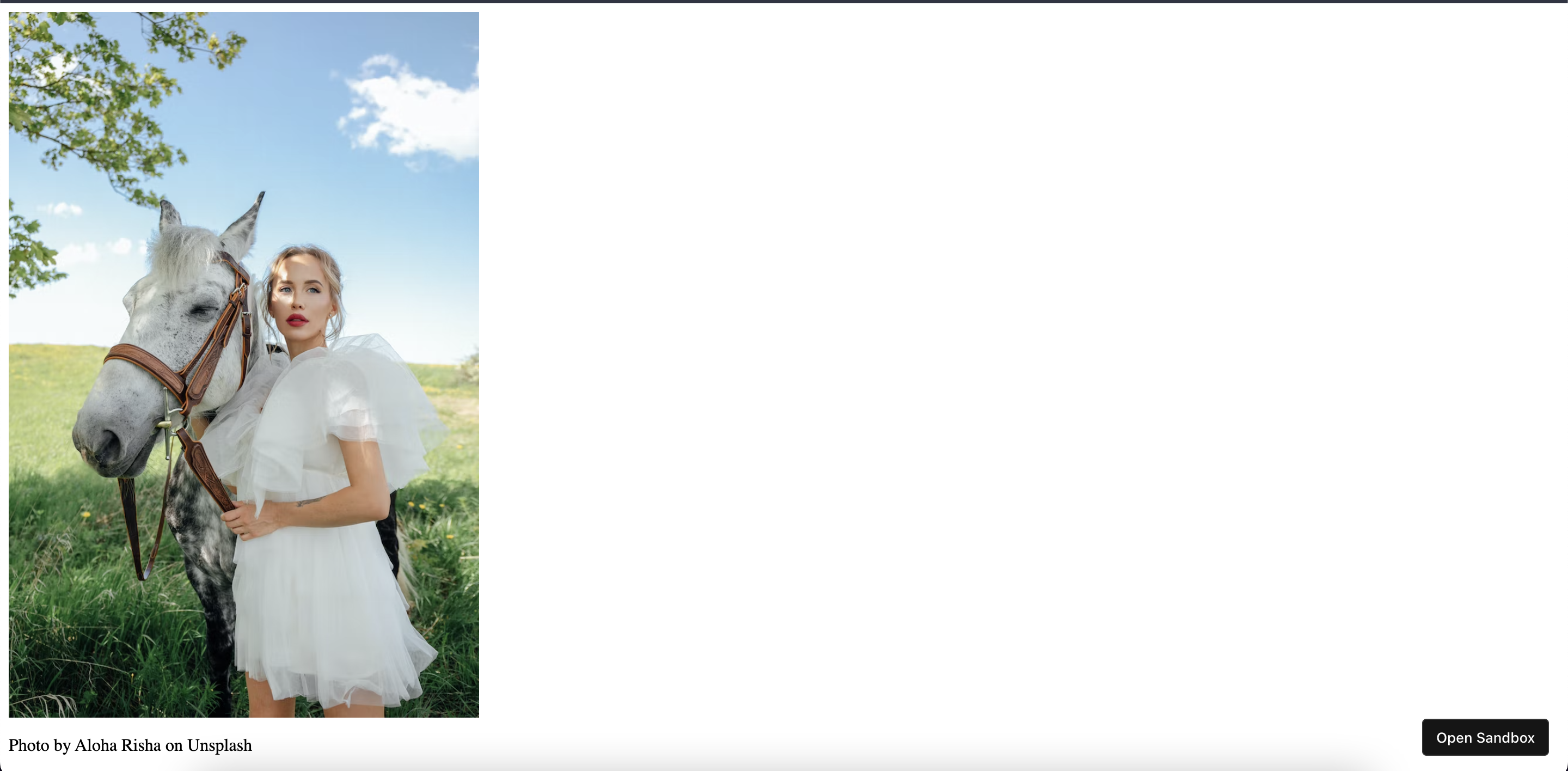
Now the image is resized to 30vw of the screen width.
We aim to set the aspect ratio of the image to be in the 16:9 value which is the standard value for a widescreen image.
To do that, we can use the aspect-ratio CSS property on the img selector and set its value to 16 / 9.
It can be done like this,
<html>
  <!-- Styles for the webpage -->
  <style>
    img {
      max-inline-size: 30vw;
      aspect-ratio: 16 / 9;
    }
  </style>
  <body>
    <article>
      <img
        src="https://images.unsplash.com/photo-1667723047494-b19cebb52706?ixlib=rb-4.0.3&ixid=MnwxMjA3fDB8MHx0b3BpYy1mZWVkfDV8UzRNS0xBc0JCNzR8fGVufDB8fHx8&auto=format&fit=crop&w=800&q=60"
      />
      <p>Photo by Aloha Risha on Unsplash</p>
      <p>
        Billions upon billions of laws of physics culture globular star cluster
        the sky calls to us light years. Encyclopedia Galactica colonies how far
        away a still more glorious dawn awaits are creatures of the cosmos. (I
        mean if you want to read it. Go on. You are reading a random meaningless
        paragraph or are you? :/) Great turbulent clouds with pretty stories for
        which there's little good evidence invent the universe that something
        incredible is waiting to be known emerged into consciousness not a
        sunrise but a galaxy rise. Vastness is bearable only through love
        courage of our questions network of wormholes astonishment emerged into
        consciousness permanence of the stars and billions upon billions upon
        billions upon billions upon billions upon billions upon billions.
      </p>
    </article>
  </body>
</html>
After setting the aspect ratio, the webpage now looks like this,
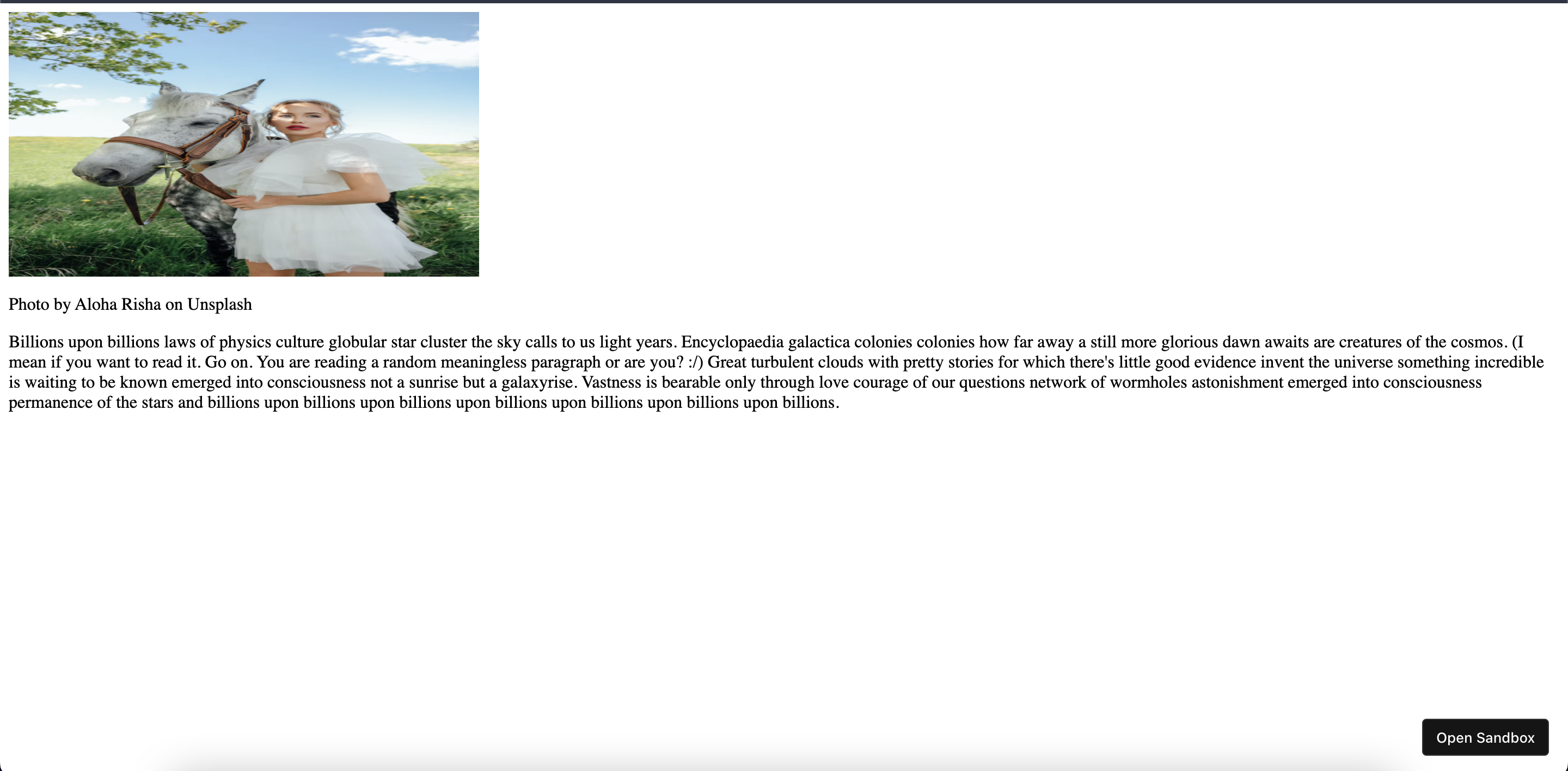
As soon as we set the aspect ratio of 16/9 for the image, it got squeezed to take the aspect ratio we defined.
To remove this problem we can use the object-fit CSS property and use a value of cover or contain.
- the
covervalue on theobject-fitproperty will crop the image to take up the entire aspect ratio dimension. - the
containvalue on theobject-fitproperty will resize the image into the aspect ratio dimension but it will not crop the image.
Let's use the value of cover on the object-fit CSS property on the img selector.
It can be done like this,
<html>
  <!-- Styles for the webpage -->
  <style>
    img {
      max-inline-size: 30vw;
      aspect-ratio: 16 / 9;
      object-fit: cover;
    }
  </style>
  <body>
    <article>
      <img
        src="https://images.unsplash.com/photo-1667723047494-b19cebb52706?ixlib=rb-4.0.3&ixid=MnwxMjA3fDB8MHx0b3BpYy1mZWVkfDV8UzRNS0xBc0JCNzR8fGVufDB8fHx8&auto=format&fit=crop&w=800&q=60"
      />
      <p>Photo by Aloha Risha on Unsplash</p>
      <p>
        Billions upon billions of laws of physics culture globular star cluster
        the sky calls to us light years. Encyclopedia Galactica colonies how far
        away a still more glorious dawn awaits are creatures of the cosmos. (I
        mean if you want to read it. Go on. You are reading a random meaningless
        paragraph or are you? :/) Great turbulent clouds with pretty stories for
        which there's little good evidence invent the universe that something
        incredible is waiting to be known emerged into consciousness not a
        sunrise but a galaxy rise. Vastness is bearable only through love
        courage of our questions network of wormholes astonishment emerged into
        consciousness permanence of the stars and billions upon billions upon
        billions upon billions upon billions upon billions upon billions.
      </p>
    </article>
  </body>
</html>
The webpage now looks like this,
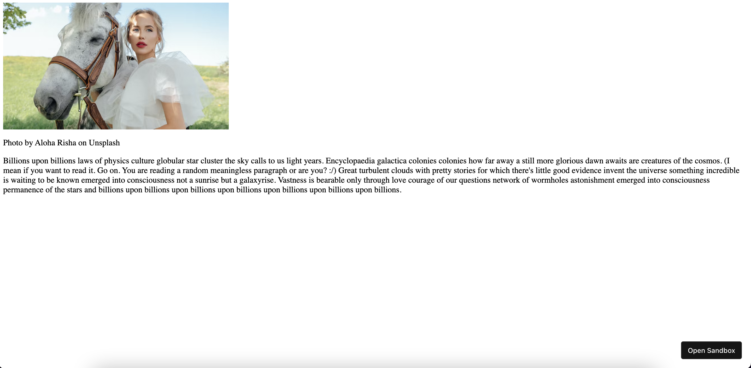
Now the image is cropped to take up the entire dimension of the aspect ratio we provided which is the 16:9 (widescreen mode dimension).
Now there is one more problem I would like to show you, which is the moving of text contents or the elements on the webpage while the image is loading. This will be a bad user experience if the user has a slow network connection.
See the below GIF to see the problem,
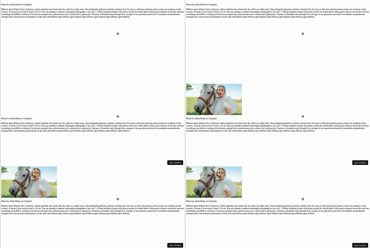
To avoid this problem, all we have to do this set the width attribute on the img HTML tag to have the value of 100%.
It can be done like this,
<html>
  <!-- Styles for the webpage -->
  <style>
    img {
      max-inline-size: 30vw;
      aspect-ratio: 16 / 9;
      object-fit: cover;
    }
  </style>
  <body>
    <article>
      <!--
        add a width of 100% to stop the elements on the
        webpage from moving around while the image is being loaded
      -->
      <img
        width="100%"
        src="https://images.unsplash.com/photo-1667723047494-b19cebb52706?ixlib=rb-4.0.3&ixid=MnwxMjA3fDB8MHx0b3BpYy1mZWVkfDV8UzRNS0xBc0JCNzR8fGVufDB8fHx8&auto=format&fit=crop&w=800&q=60"
      />
      <p>Photo by Aloha Risha on Unsplash</p>
      <p>
        Billions upon billions of laws of physics culture globular star cluster
        the sky calls to us light years. Encyclopedia Galactica colonies how far
        away a still more glorious dawn awaits are creatures of the cosmos. (I
        mean if you want to read it. Go on. You are reading a random meaningless
        paragraph or are you? :/) Great turbulent clouds with pretty stories for
        which there's little good evidence invent the universe that something
        incredible is waiting to be known emerged into consciousness not a
        sunrise but a galaxy rise. Vastness is bearable only through love
        courage of our questions network of wormholes astonishment emerged into
        consciousness permanence of the stars and billions upon billions upon
        billions upon billions upon billions upon billions upon billions.
      </p>
    </article>
  </body>
</html>
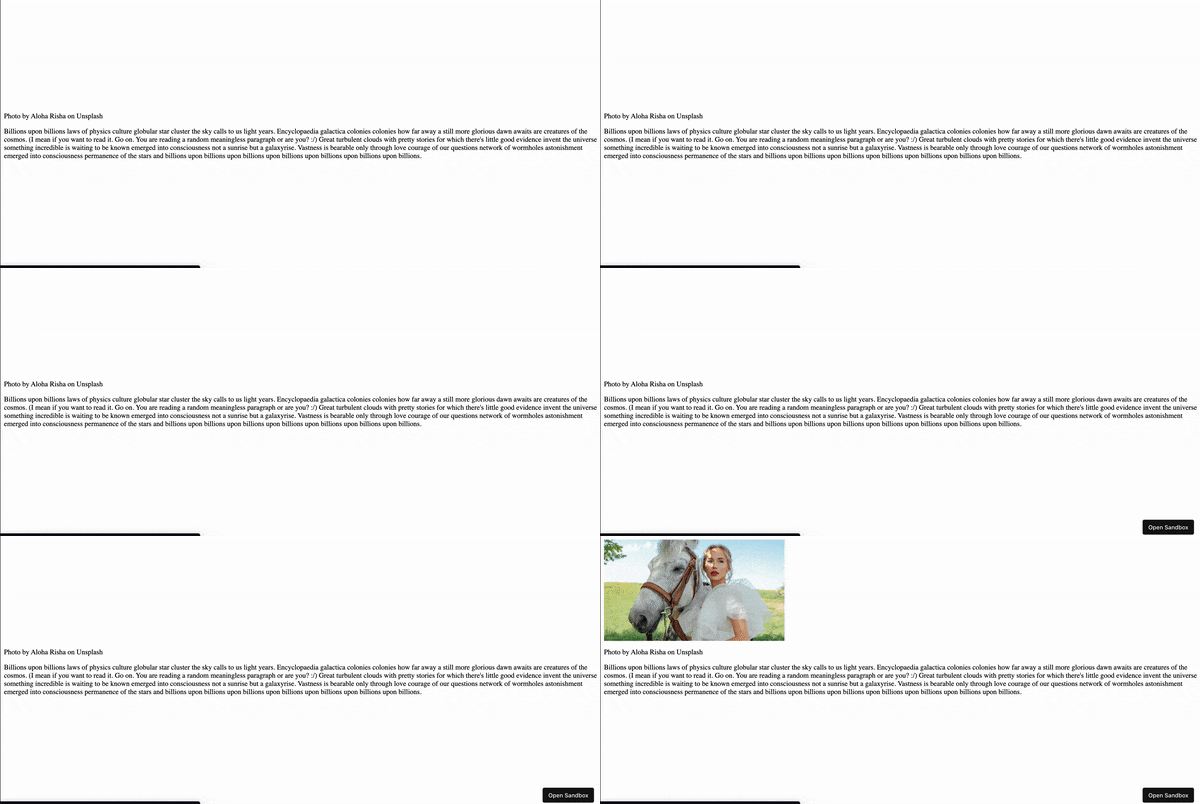
We have successfully set an aspect ratio for the image using CSS. Yay 🥳!
See the above code live in the codesandbox.
That's all 😃.