To make the font size grow according to the width of the screen, the better way is to use the clamp() CSS function and pass the minimum font size value, the preferred font size value and finally the maximum font size value it should take according to the width of the screen.
The clamp() CSS function accepts three arguments such as:
- the first argument is the minimum value to stop resizing the font size if it is equal to or below a supplied font-size value.
- the second argument is the rate at which the font size should grow according to the screen size.
- the third argument is the maximum value to stop resizing the font size if it is equal to or above a supplied font-size value.
NOTE: clamp() CSS function is not only reserved for the font-size property and can be used in various other properties too. The above explanation is to understand its usage of it concerning the font-size CSS property
TL;DR
<html>
  <body>
    <p>Hello World</p>
  </body>
  <!-- Style for fonts -->
  <!--
    Add `0.75rem` with `2vw` as the second
    argument to the `clamp()` CSS function
    - add a minimum value as the first argument
    - add a maximum value as the third argument
  -->
  <style>
    p {
      font-size: clamp(1rem, 2vw + 0.75rem, 1.5rem);
    }
  </style>
</html>
For example, let's say we have a text called Hello World on the webpage. The HTML for that would look something like this,
<html>
  <body>
    <p>Hello World</p>
  </body>
</html>
To grow the font size of the paragraph tag text at a rate of 1% to the width of the screen, we can use the 2vw unit in CSS.
NOTE: 1vw unit refers to 1%of the width of the screen.
To do that let's define our font-size CSS property and then use the 2vw the like this,
<html>
  <body>
    <p>Hello World</p>
  </body>
  <!-- Style for fonts -->
  <style>
    p {
      font-size: 2vw;
    }
  </style>
</html>
Now there are 2 problems with this approach:
-
one is the font size won't increase if the user tries to magnify the webpage, because the font size property is tied to the view width or the width of the screen only.
-
the second one is if the width of the screen is too low, the font size becomes too small to read and if the screen becomes too big it becomes really large also.
Visually the webpage looks like this,

To avoid this problem, let's first tie the font size unit with the relative root font-size value of the webpage, in our case we will be using 0.75rem. The 0.75rem means 0.75 * 16px (In our case, 16px is the default font size of the root element).
So let's add the 0.75rem unit with the 2vw using the clamp() CSS function and pass this value as the second argument to the function.
It can be done like this,
<html>
  <body>
    <p>Hello World</p>
  </body>
  <!-- Style for fonts -->
  <!--
    Add `0.75rem` with `2vw` as the second
    argument to the `clamp()` CSS function
  -->
  <style>
    p {
      font-size: clamp(0, 2vw + 0.75rem, 0);
    }
  </style>
</html>
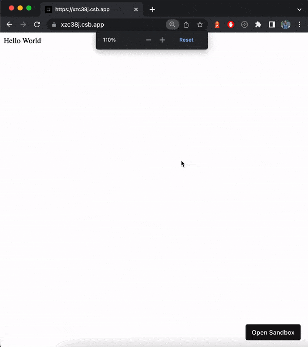
Now when the user magnifies the webpage, the font size increases.
It looks like this,
Now the only problem is that we need to set a minimum font size till it should decrease and a maximum value the font size should increase and then stops. Otherwise, it will keep on increasing or decreasing as the screen keeps on getting smaller or bigger.
To do that we need to pass the minimum font size and the maximum font size as the first and third arguments to the clamp() size CSS function.
Let's pass the value of 1rem as the minimum value and 1.5rem as the maximum value.
It can be done like this,
<html>
  <body>
    <p>Hello World</p>
  </body>
  <!-- Style for fonts -->
  <!--
    Add `0.75rem` with `2vw` as the second
    argument to the `clamp()` CSS function
    - add a minimum value as the first argument
    - add a maximum value as the third argument
  -->
  <style>
    p {
      font-size: clamp(1rem, 2vw + 0.75rem, 1.5rem);
    }
  </style>
</html>
Now the webpage has a minimum and maximum font size it can scale to.
The webpage text now scales like this when screen size increases or decreases,

We have successfully made the font size grow according to screen size. Yay 🥳!
See the above code live in codesandbox.
That's all 😃.