To load images of different sizes on different screen widths or sizes using HTML, you can use the srcset attribute on the img HTML tag and the value should be the url of the image followed by a whitespace and the original width of the image. The width should end with the unit of w (1w means 1px). If you have more image sizes then the , symbol (comma) should be used to separate the values (image url and its original width).
The srcset should be used along with the src attribute. According to the user's device width, the browser will automatically choose the image url from the srcset attribute values and replace it with the default value on the src attribute.
Why is this used?
Sometimes on smaller screen devices, downloading a big image is not needed and will also be affecting the network bandwidth of the device which in turn affects the performance of our website on smaller devices. To compact this problem the srcset attribute is introduced in the img HTML tag.
TL;DR
<html>
<style>
/* Basic styles for image */
img {
max-inline-size: 30vw;
block-size: auto;
}
</style>
<body>
<!--
using the `srcset` attribute on the `img` HTML tag to set
different image URLs and the image widths to be chosen
automatically by the browser according to the user's device-width
-->
<img
src="/01_small.jpeg"
srcset="/01_small.jpeg 640w, /02_medium.jpeg 1920w, /03_large.jpeg 2400w"
/>
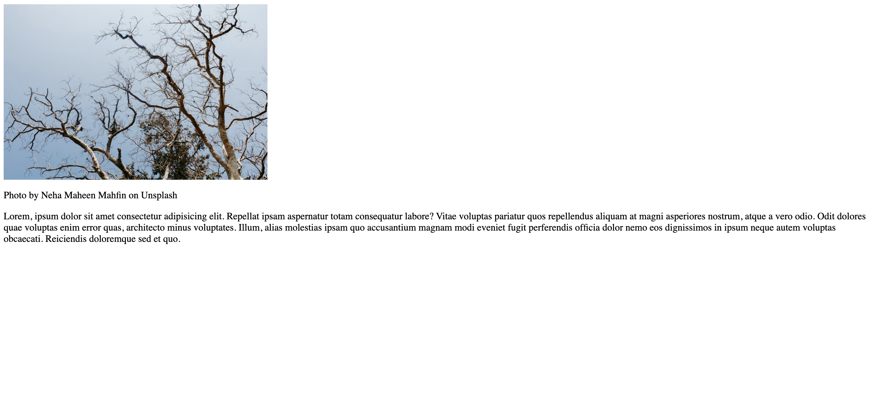
<p>Photo by Neha Maheen Mahfin on Unsplash</p>
<p>
Lorem, ipsum dolor sit amet consectetur adipisicing elit. Repellat ipsam
aspernatur totam consequatur labore? Vitae voluptas pariatur quos
repellendus aliquam at magni asperiores nostrum, atque a vero odio. Odit
dolores quae voluptas enim error quas, architecto minus voluptates. Illum,
alias molestias ipsam quo accusantium magnam modi eveniet fugit
perferendis officia dolor nemo eos dignissimos in ipsum neque autem
voluptas obcaecati. Reiciendis doloremque sed et quo.
</p>
</body>
</html>
For example, let's say we have a webpage with an image tag (img) and a random paragraph (p) like this,
<html>
  <style>
    /* Basic styles for image */
    img {
      max-inline-size: 30vw;
      block-size: auto;
    }
  </style>
  <body>
    <img src="/01_small.jpeg" />
    <p>Photo by Neha Maheen Mahfin on Unsplash</p>
    <p>
      Lorem, ipsum dolor sit amet consectetur adipisicing elit. Repellat ipsam
      aspernatur totam consequatur labore? Vitae voluptas pariatur quos
      repellendus aliquam at magni asperiores nostrum, atque a vero odio. Odit
      dolores quae voluptas enim error quas, architecto minus voluptates. Illum,
      alias molestias ipsam quo accusantium magnam modi eveniet fugit
      perferendis officia dolor nemo eos dignissimos in ipsum neque autem
      voluptas obcaecati. Reiciendis doloremque sed et quo.
    </p>
  </body>
</html>
The webpage now looks like this,
As you can see from the above code that in the img HTML tag, we have used the src tag and given an image url as the value. Currently, the browser downloads this image on every screen size.
Now let's introduce the srcset attribute on the img tag and use different image URLs for different screen widths.
These are the image URLs and their original widths which we are going to set as the values of the srcset attribute:
- for the image url
01_small.jpegit has an original width of640w - for the image url
02_medium.jpegit has an original width of1920w - for the image url
03_large.jpegit has an original width of2400w
The values for the srcset attribute should be in the format where the image url is first followed by a whitespace and then the original width of the image with the unit of w. Since we have three image URLs, we have to separate them using the , symbol (comma).
It can be done like this,
<html>
  <style>
    /* Basic styles for image */
    img {
      max-inline-size: 30vw;
      block-size: auto;
    }
  </style>
  <body>
    <!--
      using the `srcset` attribute on the `img` HTML tag to set
      different image URLs and the image widths to be chosen
      automatically by the browser according to the user's device-width
    -->
    <img
      src="/01_small.jpeg"
      srcset="/01_small.jpeg 640w, /02_medium.jpeg 1920w, /03_large.jpeg 2400w"
    />
    <p>Photo by Neha Maheen Mahfin on Unsplash</p>
    <p>
      Lorem, ipsum dolor sit amet consectetur adipisicing elit. Repellat ipsam
      aspernatur totam consequatur labore? Vitae voluptas pariatur quos
      repellendus aliquam at magni asperiores nostrum, atque a vero odio. Odit
      dolores quae voluptas enim error quas, architecto minus voluptates. Illum,
      alias molestias ipsam quo accusantium magnam modi eveniet fugit
      perferendis officia dolor nemo eos dignissimos in ipsum neque autem
      voluptas obcaecati. Reiciendis doloremque sed et quo.
    </p>
  </body>
</html>
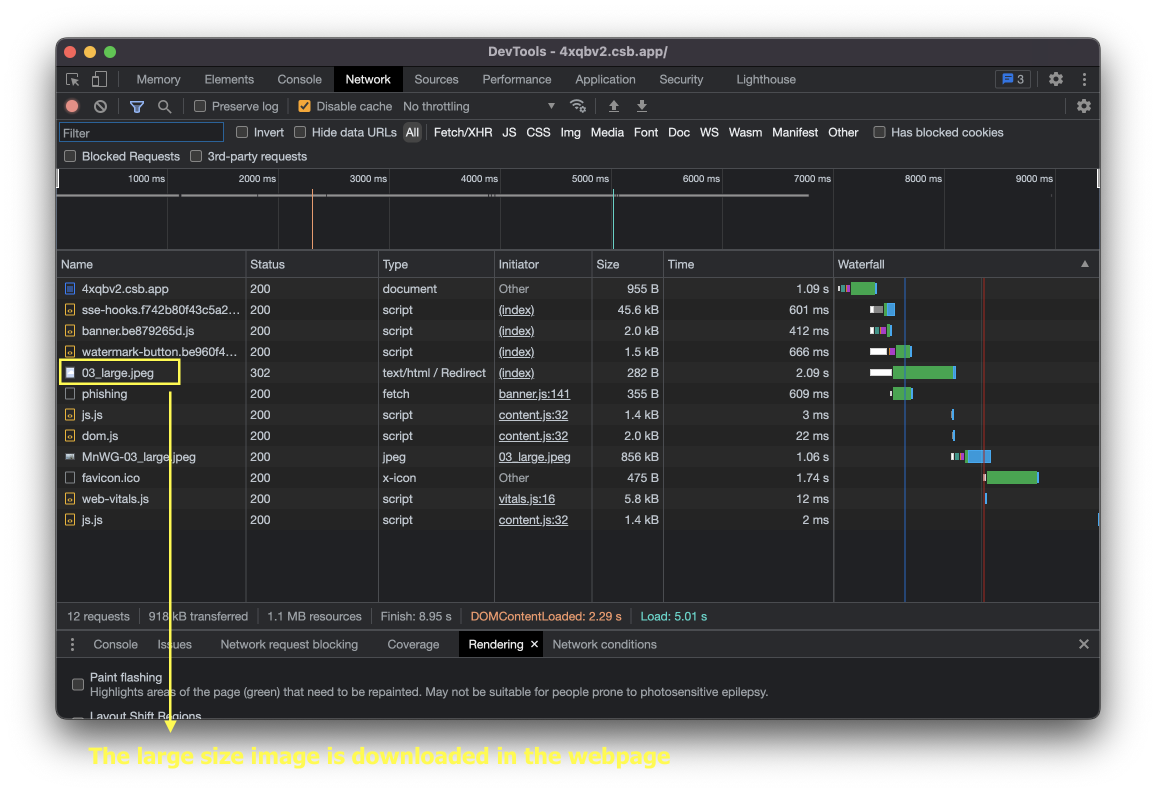
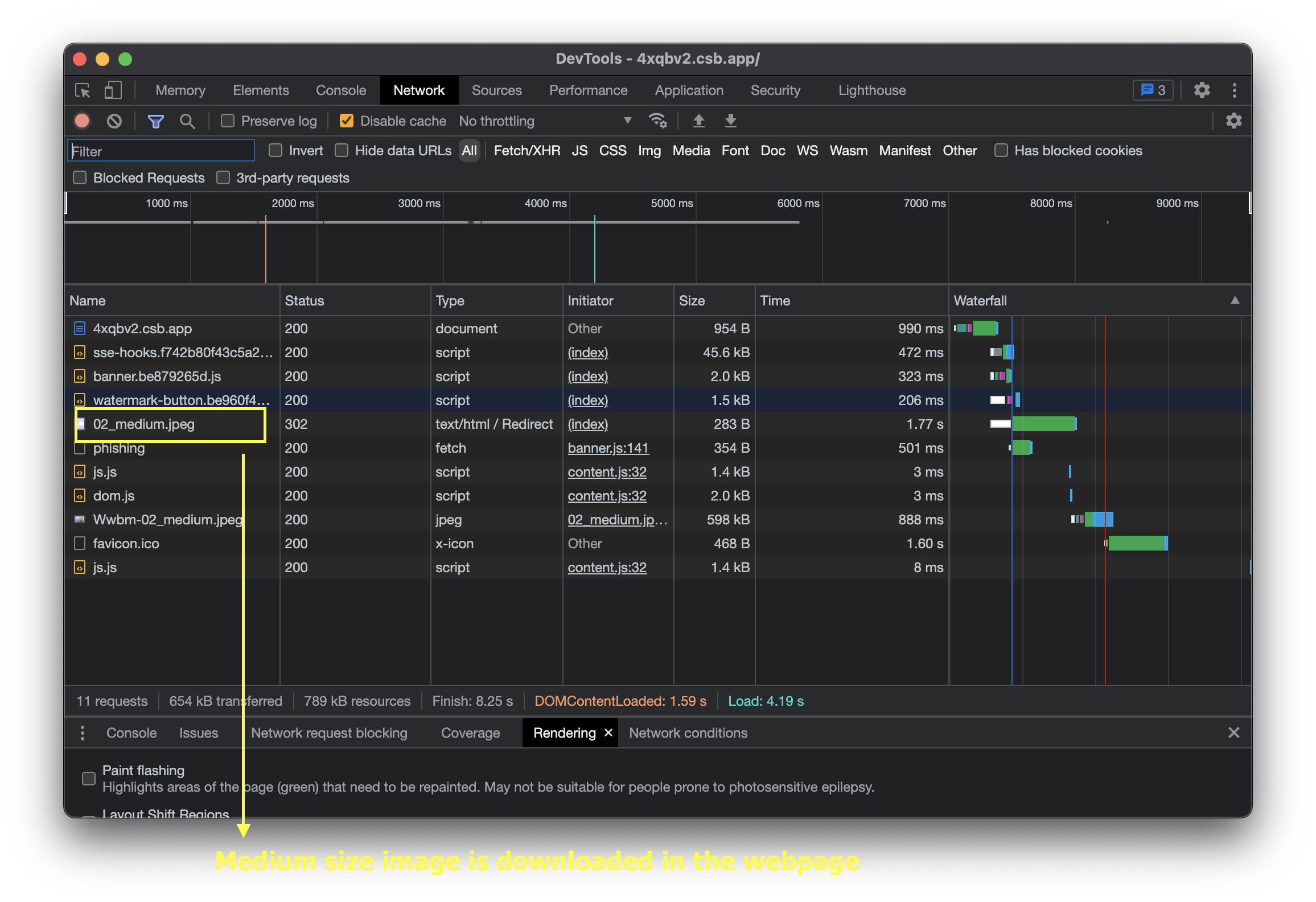
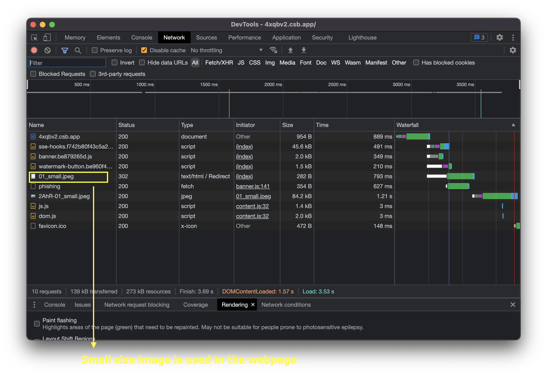
Now let's check the Devtools (if you are in chrome, you can right-click on the webpage, and select the Inspect option) and go to the Network tab to see which size is getting downloaded for each screen size.
Screen size of 1440px
Screen size of 1000px
Screen size of 500px
This will help a lot in improving the performance of the webpage.
We have successfully loaded different image sizes on different screen sizes or widths using HTML. Yay 🥳.
See the above code live in the codesandbox.
That's all 😃.