To fetch an image on priority on a webpage using HTML, you can use the link HTML tag and use the attribute of rel with the value of prefetch which instructs the browser that the image needed to be downloaded on priority, then the href attribute with the value of the image's url and finally the as attribute having the value of image to define the type of the asset you are prefetching.
The link tag should be placed inside the head tag of the HTML code.
TL;DR
<html>
  <!--
    The `link` tag for prefetching the image
    should be inside the `head` tag
  -->
  <link
    rel="prefetch"
    href="https://images.unsplash.com/photo-1667584412550-95241626c80a?ixlib=rb-4.0.3&ixid=MnwxMjA3fDB8MHxwaG90by1wYWdlfHx8fGVufDB8fHx8&auto=format&fit=crop&w=687&q=80"
    as="image"
  />

  <!-- Basic style for the image to make it responsive -->
  <style>
    img {
      max-inline-size: 20vw;
      block-size: auto;
      aspect-ratio: 1 / 1;
      object-fit: contain;
    }
  </style>
  <body>
    <img
      width="100%"
      src="https://images.unsplash.com/photo-1667584412550-95241626c80a?ixlib=rb-4.0.3&ixid=MnwxMjA3fDB8MHxwaG90by1wYWdlfHx8fGVufDB8fHx8&auto=format&fit=crop&w=687&q=80"
    />
    <p>Photo by Nico Knaack on Unsplash</p>
    <p>
      Lorem ipsum dolor sit amet consectetur adipisicing elit. Provident quis
      sequi placeat quisquam doloremque dignissimos qui, asperiores maiores nam,
      repudiandae, recusandae distinctio libero odio nesciunt quidem repellat
      laudantium quo error itaque! Placeat corporis inventore saepe quae non
      sunt fugit omnis, architecto quibusdam incidunt ex voluptatum et itaque
      alias, nisi dolores molestias aliquam officia fuga aut nulla perferendis.
      Ea sapiente corrupti minima eum harum, voluptatibus molestiae.
    </p>
  </body>
</html>
NOTE: Only use the prefetching of images using the link tag if the image is of vital importance. Since prefetching, an image using the link tag will stop all the other prefetches like the prefetching of scripts, fonts, etc.
For example, let's say we have a webpage with some text and an image.
The HTML code would look something like this,
<html>
  <style>
    img {
      max-inline-size: 20vw;
      block-size: auto;
      aspect-ratio: 1 / 1;
      object-fit: contain;
    }
  </style>
  <body>
    <img
      width="100%"
      src="https://images.unsplash.com/photo-1667584412550-95241626c80a?ixlib=rb-4.0.3&ixid=MnwxMjA3fDB8MHxwaG90by1wYWdlfHx8fGVufDB8fHx8&auto=format&fit=crop&w=687&q=80"
    />
    <p>Photo by Nico Knaack on Unsplash</p>
    <p>
      Lorem ipsum dolor sit amet consectetur adipisicing elit. Provident quis
      sequi placeat quisquam doloremque dignissimos qui, asperiores maiores nam,
      repudiandae, recusandae distinctio libero odio nesciunt quidem repellat
      laudantium quo error itaque! Placeat corporis inventore saepe quae non
      sunt fugit omnis, architecto quibusdam incidunt ex voluptatum et itaque
      alias, nisi dolores molestias aliquam officia fuga aut nulla perferendis.
      Ea sapiente corrupti minima eum harum, voluptatibus molestiae.
    </p>
  </body>
</html>
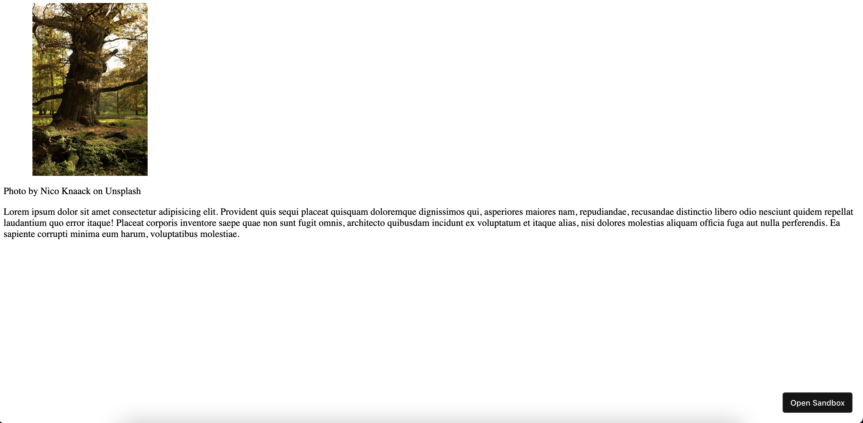
As you can see from the above code we have an img tag where the src attribute has the value of the image location. We have also added some basic style to the image to make it responsive to the screen to make it nicer to look at.
The webpage would look like this,

We aim to prefetch the same image and cache it in our browser, to do that we have to use the link tag then use the rel attribute with the value of prefetch, then the href attribute with the value of the image url which in our case is the https://images.unsplash.com/photo-1667584412550-95241626c80a?ixlib=rb-4.0.3&ixid=MnwxMjA3fDB8MHxwaG90by1wYWdlfHx8fGVufDB8fHx8&auto=format&fit=crop&w=687&q=80 url and finally using the as attribute having the value of image to set the type of the asset we are prefetching.
It can be done like this,
<html>
  <!--
    The `link` tag for prefetching the image
    should be inside the `head` tag
  -->
  <link
    rel="prefetch"
    href="https://images.unsplash.com/photo-1667584412550-95241626c80a?ixlib=rb-4.0.3&ixid=MnwxMjA3fDB8MHxwaG90by1wYWdlfHx8fGVufDB8fHx8&auto=format&fit=crop&w=687&q=80"
    as="image"
  />

  <!-- Basic style for the image to make it responsive -->
  <style>
    img {
      max-inline-size: 20vw;
      block-size: auto;
      aspect-ratio: 1 / 1;
      object-fit: contain;
    }
  </style>
  <body>
    <img
      width="100%"
      src="https://images.unsplash.com/photo-1667584412550-95241626c80a?ixlib=rb-4.0.3&ixid=MnwxMjA3fDB8MHxwaG90by1wYWdlfHx8fGVufDB8fHx8&auto=format&fit=crop&w=687&q=80"
    />
    <p>Photo by Nico Knaack on Unsplash</p>
    <p>
      Lorem ipsum dolor sit amet consectetur adipisicing elit. Provident quis
      sequi placeat quisquam doloremque dignissimos qui, asperiores maiores nam,
      repudiandae, recusandae distinctio libero odio nesciunt quidem repellat
      laudantium quo error itaque! Placeat corporis inventore saepe quae non
      sunt fugit omnis, architecto quibusdam incidunt ex voluptatum et itaque
      alias, nisi dolores molestias aliquam officia fuga aut nulla perferendis.
      Ea sapiente corrupti minima eum harum, voluptatibus molestiae.
    </p>
  </body>
</html>
Now the image will be prefetched before all other scripts, font files, etc., and will be cached by the browser for later use.
We have successfully fetched an image on priority using the HTML. Yay 🥳!
See the above code live in the codesandbox.
That's all 😃.