To check if the user's device has a touchscreen using only CSS, you can use the @media CSS rule and then use the pointer CSS media feature and set its value as coarse. If the user's device or the browsing device is a touchscreen, the pointer: coarse CSS media feature code block will be triggered where you can define the CSS styles to get applied for the touchscreen.
TL;DR
<!-- A simple webpage with a `button` HTML element -->
<html>
  <style>
    /* Using the `pointer: coarse` CSS media feature to set styles for a touchscreen device */
    @media (pointer: coarse) {
      button {
        background-color: green;
        color: white;
      }
    }
  </style>
  <body>
    <button>Click Me</button>
  </body>
</html>
For example, let's say we have a webpage with a button HTML element like this,
<!-- A simple webpage with a `button` HTML element -->
<html>
  <body>
    <button>Click Me</button>
  </body>
</html>
The webpage looks like this,

The above webpage screenshot is from a desktop device. As you can see that the button has a white background color.
Now let's change the color of the button HTML element to a green color when the webpage is opened on a touchscreen device.
To do that first, we can add the @media CSS media rule with the pointer: coarse CSS media feature.
It can be done like this,
<!-- A simple webpage with a `button` HTML element -->
<html>
  <style>
    /* Using the `pointer: coarse` CSS media feature to set styles for a touchscreen device */
    @media (pointer: coarse) {
      /* Styles for touchscreen devices can be added here */
    }
  </style>
  <body>
    <button>Click Me</button>
  </body>
</html>
Now to change the color of the button to green color, we can use the background-color CSS property and set its value to green color inside the pointer: coarse CSS media feature.
It can be done like this,
<!-- A simple webpage with a `button` HTML element -->
<html>
  <style>
    /* Using the `pointer: coarse` CSS media feature to set styles for a touchscreen device */
    @media (pointer: coarse) {
      button {
        background-color: green;
        color: white;
      }
    }
  </style>
  <body>
    <button>Click Me</button>
  </body>
</html>
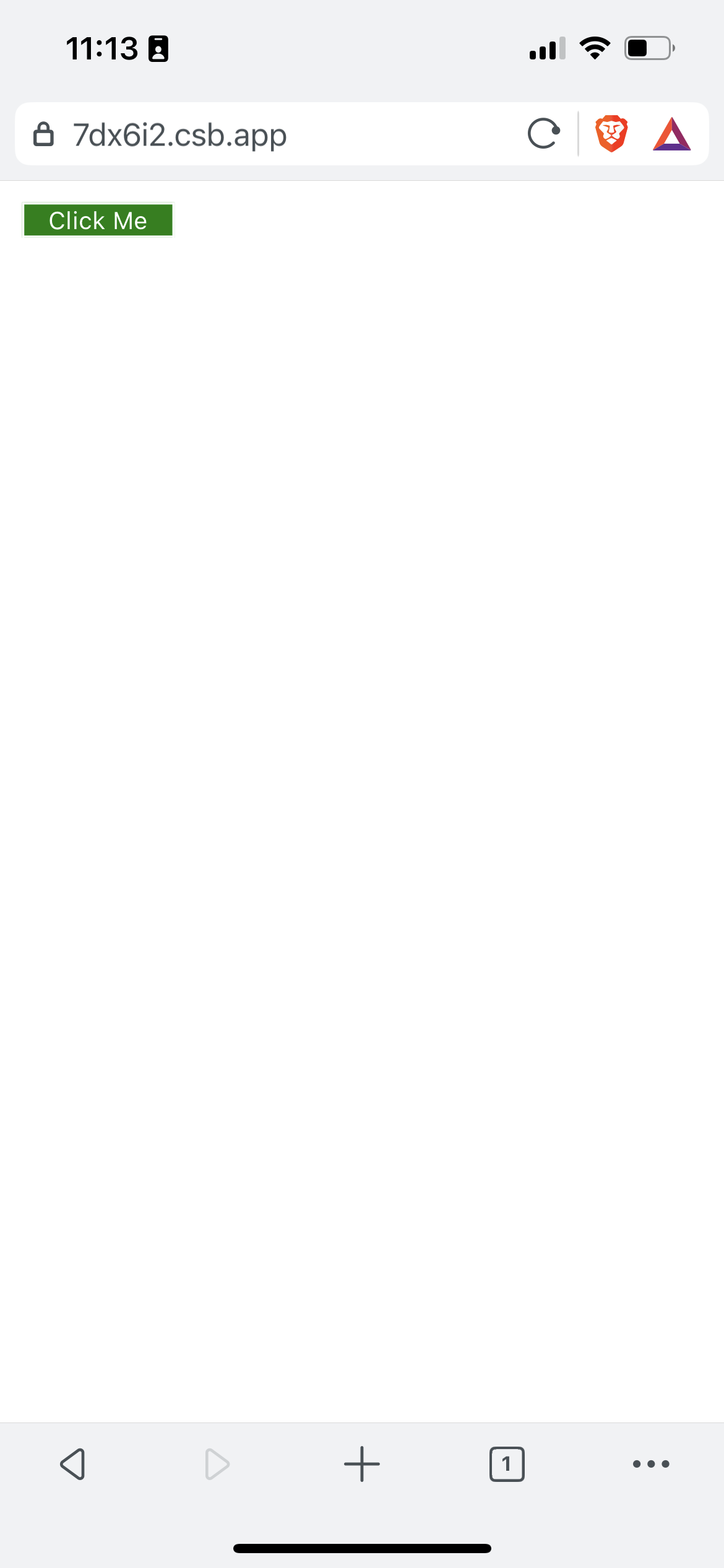
The above screenshot is from a mobile touchscreen device. As you can see that the button background color is changed to green color which proves that the CSS media feature is working as expected.
With the same media feature, we can write any kinds of functionalities we need for a touchscreen from CSS code only.
See the above code live in codesandbox.
That's all 😃.