To change the webpage CSS styles when the user changes the device orientation to 'landscape', you can use the media query syntax of @media followed by an () symbol (opening and closing brackets) and inside the brackets, you can write the keyword called orientation followed by a : symbol (colon) then the keyword called landscape to set the mode when the user changes the orientation to landscape.
After the () symbol, you can use the {} symbol (opening and closing curly brackets) and define the styles that need to be applied when the orientation of the device changes to the landscape.
TL;DR
<html>
  <body>
    <p>Hello World</p>
  </body>

  <!-- CSS styles for the body and the paragrapgh tags -->
  <!--
    @media syntax and the `landscape` orientation syntax
    to change styles when the user changes orientation
  -->
  <style>
    body {
      background-color: black;
    }

    p {
      color: white;
    }

    @media (orientation: landscape) {
      body {
        background-color: white;
      }

      p {
        color: black;
      }
    }
  </style>
</html>
For example, let's say we have a webpage where the background color of the body is black and the color of the paragraph text is white by default like this,
<html>
  <body>
    <p>Hello World</p>
  </body>

  <!-- CSS styles for the body and the paragraph tags -->
  <style>
    body {
      background-color: black;
    }

    p {
      color: white;
    }
  </style>
</html>
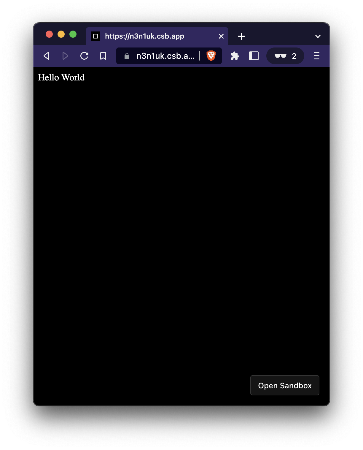
The webpage will look like this with the above styles,
We aim to change the background color of the body to white and the paragraph text color to white when the user changes the orientation of the device to landscape mode.
To do that, we can use the @media rule followed by the (orientation: landscape) syntax to trigger the styles for it.
It can be done like this,
<html>
  <body>
    <p>Hello World</p>
  </body>

  <!-- CSS styles for the body and the paragrapgh tags -->
  <!--
    @media syntax and the `landscape` orientation syntax
    to change styles when the user changes orientation
  -->
  <style>
    body {
      background-color: black;
    }

    p {
      color: white;
    }

    @media (orientation: landscape) {
      body {
        background-color: white;
      }

      p {
        color: black;
      }
    }
  </style>
</html>
Now when the user changes the viewport orientation, width, or height in such a manner, the webpage CSS styles are interchanged accordingly.
A representation of the CSS styles getting changed on different viewport widths is shown below,
That's all 😃.
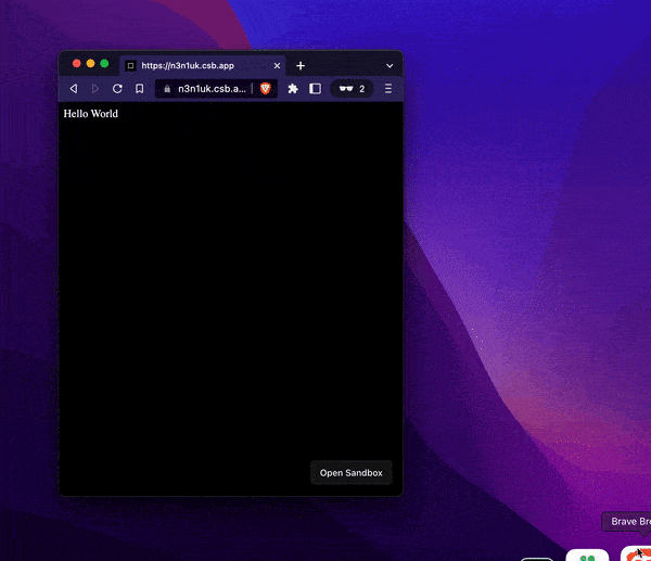
See the above code live in the codesandbox.